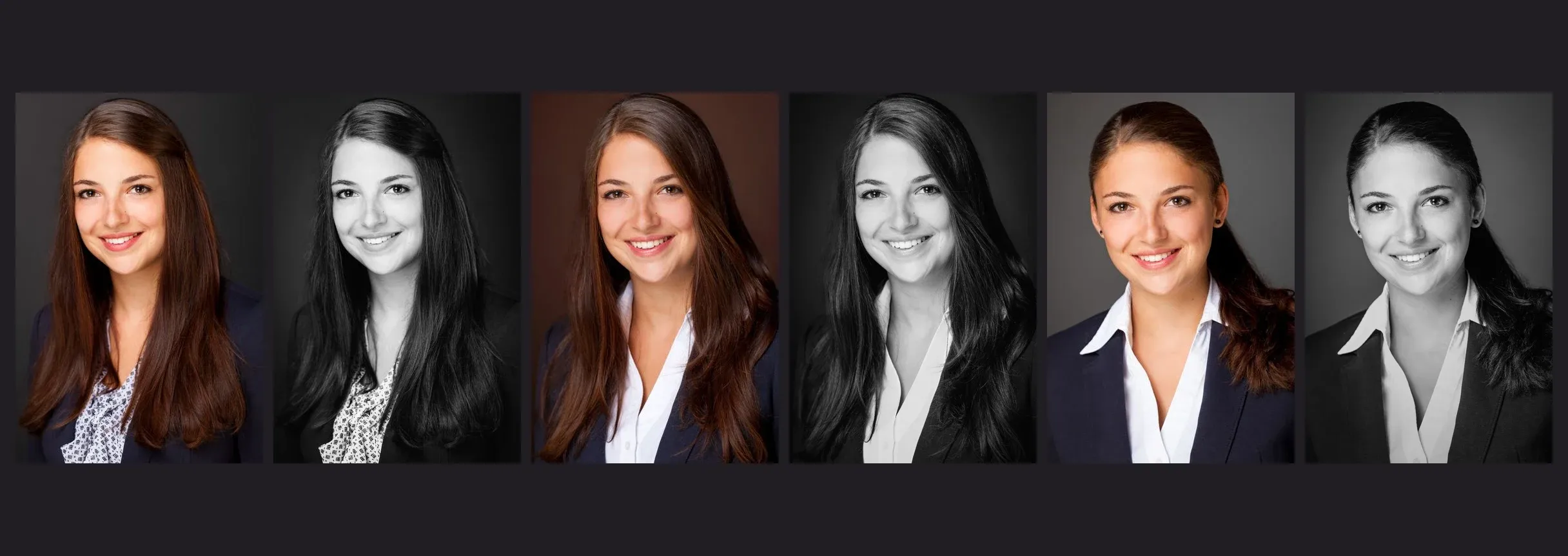
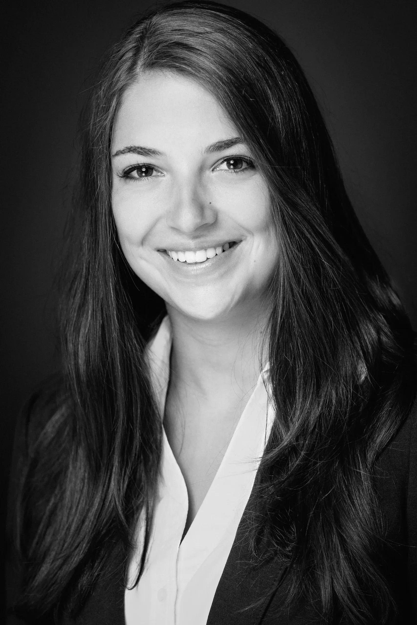
In these three photos, you see the same woman. In each one, she is looking directly into the camera and smiling. Nevertheless, the impression she gives changes significantly: In the first photo, she appears soft and youthful; in the second, somewhat more formal; and in the third, more athletic and commanding. Her hairstyle, blouse, collar, and the more visible shoulder line already shift the overall effect considerably.
Added to this is a second decision: color or black-and-white. Each image is available in both versions. This allows us to compare six different visual effects and identify the differences more precisely than if we simply said, “I like this one better.”
1. Loose Hair and a Lively Pattern
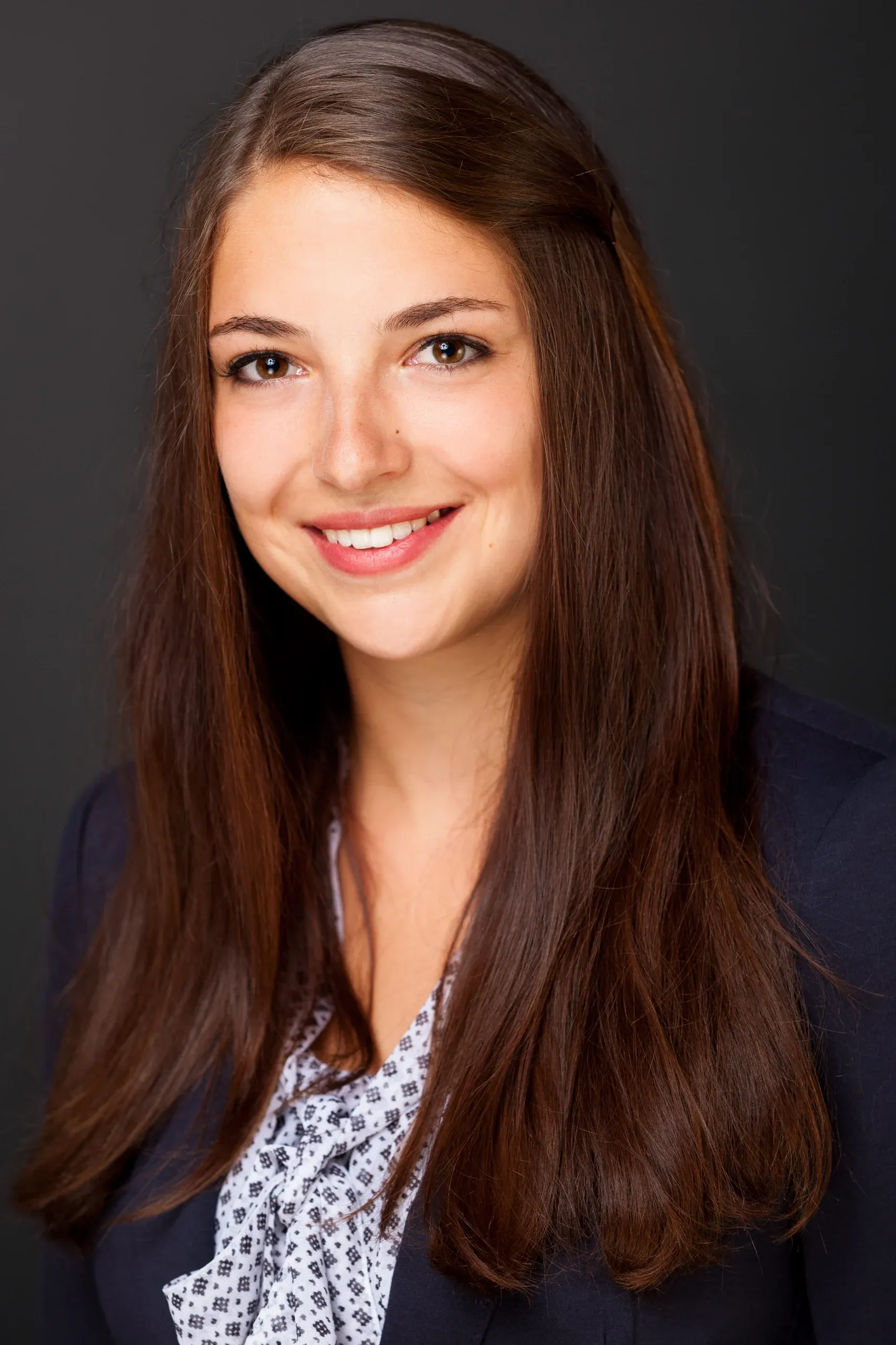
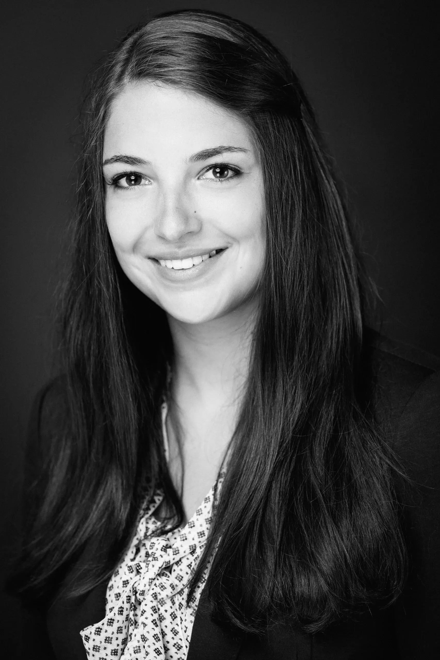
In the first image, the long hair falls forward on both sides. It frames the face and covers a large portion of the blazer lapels. As a result, the straight lines of the jacket recede into the background. The slight tilt of the head and the smile complement this soft impression. The blouse with its fine, detailed pattern adds additional movement to the image. To me, this combination comes across as friendly, open, and rather youthful.
In the color version, the warm brown of the hair and the rosy lip color contribute greatly to this effect. The dark blue blazer remains recognizable as a calm counterpoint. The light pattern adds a touch of playfulness to the outfit without a large white area drawing the eye.
In black and white, this warmth of the colors is lost. Instead, the highlights in the hair and the light-dark pattern of the blouse become more clearly perceptible as graphic elements. The friendly expression remains. The difference here is rather subtle: the photo appears slightly more minimalist, but the soft framing of the face remains the same.
2. The white collar alters the composition of the image
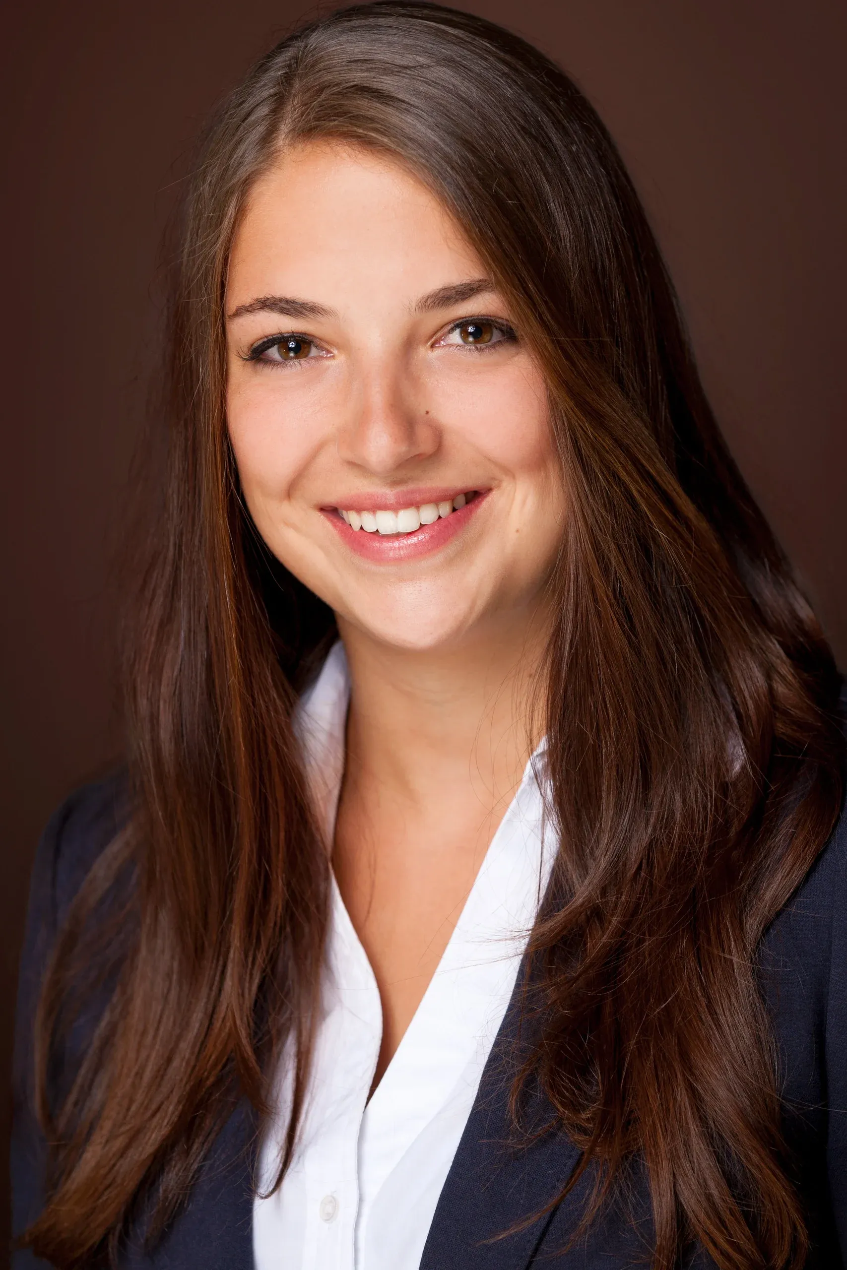
In the second image, her hair remains loose, but the patterned blouse has been replaced by a white blouse with a collar. Instead of many small contrasts, we now see a cohesive light-colored area. The collar and the opening of the blouse create clearer lines beneath the face. To me, this makes the look seem more put-together and slightly more formal, while the loose hair and broad smile keep her approachable.
The color version features a warm brown background. It echoes the hair color and visually connects the hair to its surroundings. The blue blazer stands out against this backdrop. Despite the more defined lines of the clothing, this does not create a cool overall impression.
In black and white, the difference between warm brown and dark blue disappears. Where their brightness levels are similar, the hair, jacket, and background become tonally closer. The blouse now forms the most striking light contrast. Its collar draws the eye to the face, but it can also draw too much attention to itself. That’s why I adjust its brightness so that it remains white and retains its fabric texture without drawing the eye away from the face.
3. Hair Pulled Back, Clearer Contours
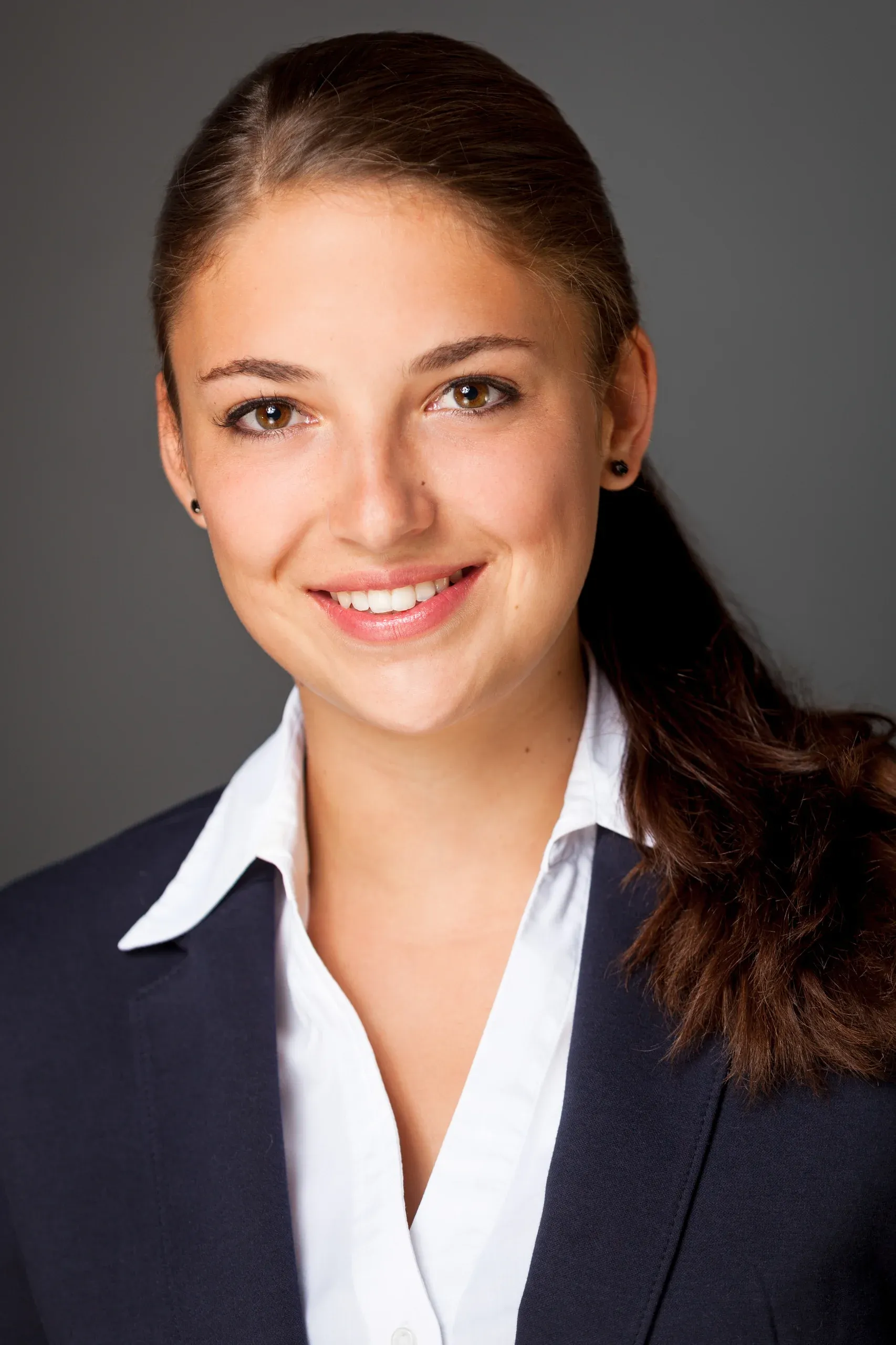
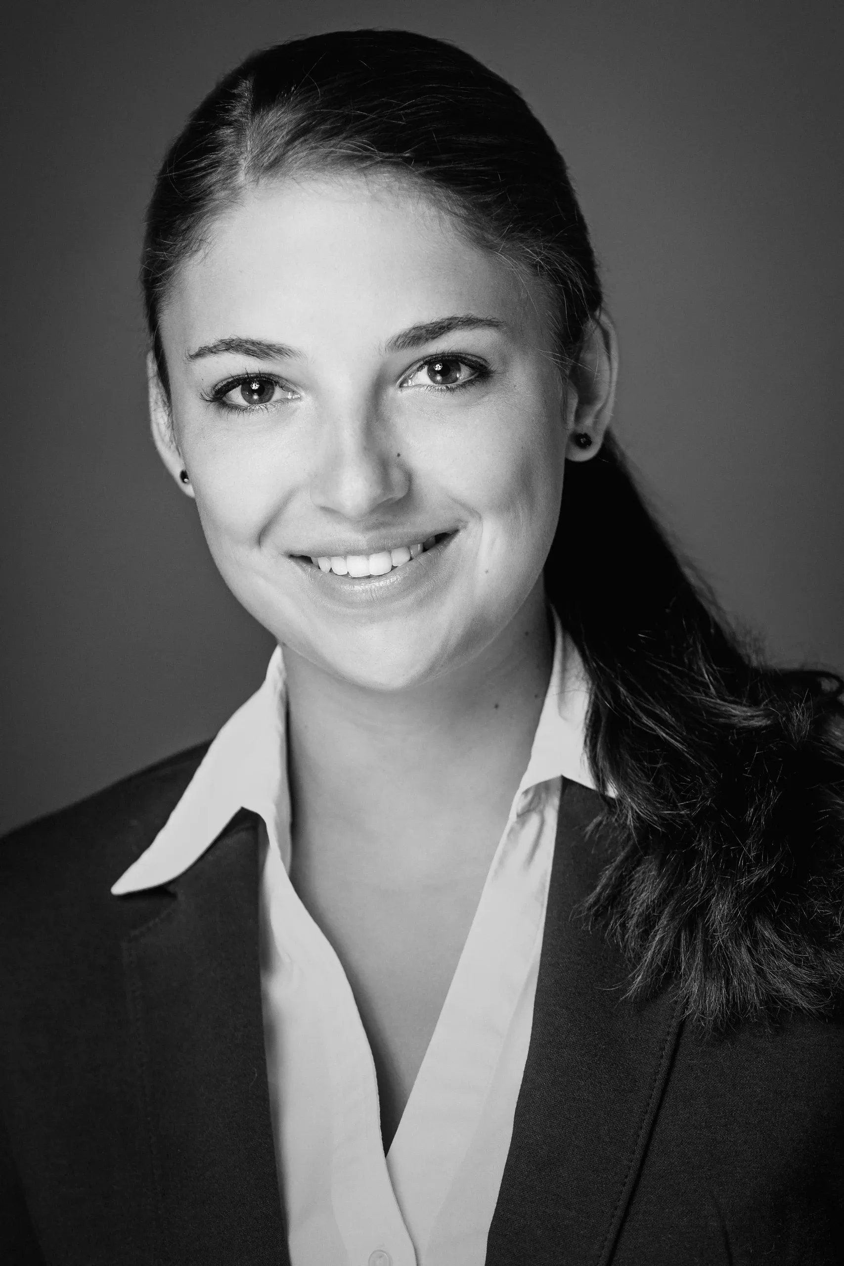
In the third image, the hair is pulled back; the ponytail falls over one shoulder. This makes the forehead, ears, cheek contours, and neck more visible. More of the blazer and its lapels are also visible. The white blouse creates distinct diagonal lines with its collar points turned outward.
The face is less framed by hair. Combined with the more clearly visible shoulder line, this creates, in my view, a sportier, more mature, and more determined appearance. The smile is still there. The more open contours and the lines of the clothing enhance her presence.
In color, the warmth of the skin and hair is preserved. The gray background remains understated, while the dark blue blazer stands out against the brown of the ponytail. This combines the cleaner composition with a lively, approachable impression.
In black and white, the composition is primarily defined by the light-colored blouse, the face, and the dark areas of the jacket. The collar lines become a particularly distinct design element. Here, the treatment changes the impression more significantly than in the first version: the image appears more graphic and focused. In this version, too, I gently tone down the brightness of the blouse so that the face remains the most prominent light area.
What effect suits your next career move?
That’s exactly why, before taking application photos, resume portraits, or business photos, I ask about your current and desired positions. I’m also interested in the type and size of the company. This helps determine the context in which your photo will be viewed and what you want to convey through your appearance.
When applying for a position as a teacher at a Montessori preschool, an open, down-to-earth impression can be a good starting point. A woodworker interviewing at a craft workshop might want to emphasize the direct, practical connection to her work more strongly. For an aspiring industrial engineer, an HR specialist, or an executive, the desired balance between approachability and a clear, professional demeanor may look different.
It also makes a difference whether you’re applying to a small, owner-operated business, a government agency, or a large corporation. Even within the same industry, teams and corporate cultures vary. That’s why I don’t simply assign a specific hairstyle to every profession. We’ll explore which of your options best suits you and the specific role.
What to Bring to the Photo Shoot
A second blouse or another top and a hairband are often enough to try out several different looks. Bring clothes that you would actually wear in your professional setting. Then, using the photos, we can check whether a pattern is too busy, whether a collar enhances the composition, or whether your hair is covering too much of your face and clothing.
When selecting images, we also consider the size in which they’ll later appear: on a resume, on a job portal, or as a small professional profile picture. A subtle color effect and a clear light-dark contrast can work differently in those contexts. For me, what matters most is how the image actually looks in its intended context. Black-and-white is one creative option here—not an automatic indicator of quality.
You can find out more about the process and the services I offer under Business Photos and Application Photos in Much. You can book the application photo packages directly online via the calendar. For more extensive business photos and personal branding, we’ll discuss your needs and schedule the appointment personally.


